This Interactive Poster Presentations page is intended for people who are giving poster presentations.
Introduction
Because of the nature of the PanSIG, which is a gathering of about 25+ different special interest groups (SIGs) of JALT, we hope that not only will your poster presentation find a welcoming audience among the SIG it is related to, but also your presentation will also give ideas to members of other SIGs, encouraging an exchange of ideas and creating a network that will help you, the presenter, the SIGs that take part and ultimately, the larger organization, JALT. Note that we're not encouraging you do "dumb it down" for a general audience, as PanSIG is a conference of people highly into specific areas; we are merely asking you to explain your terms, and to show some professional courtesy to experts from other specialities. Be prepared, though, to also scaffold the novices to your area; we're a welcoming and friendly conference, where sometimes mentors meet mentees, and earnest beginners actually have a chance to level up during the weekend.
Size and specifics for PanSIG 2024
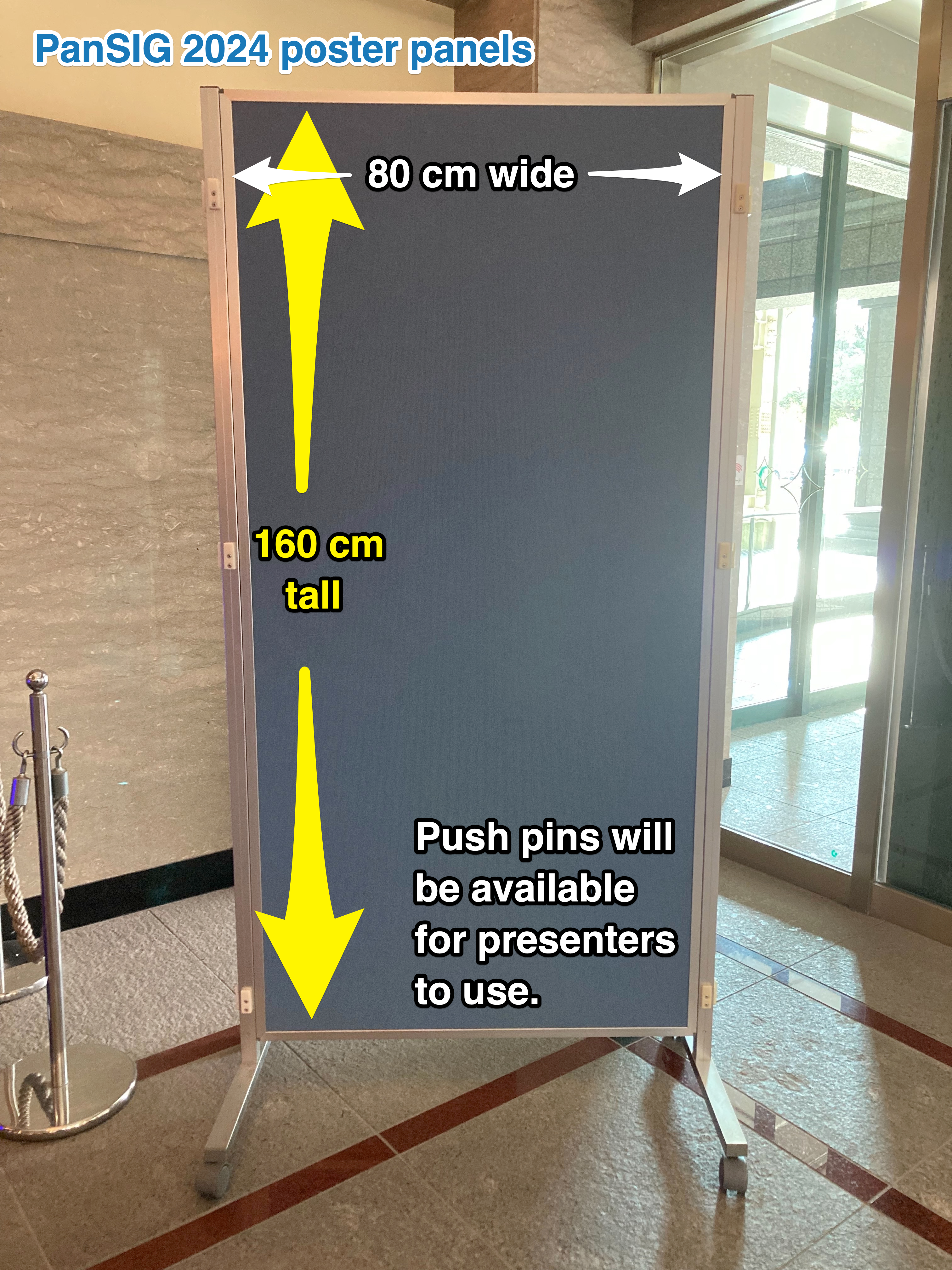
- Size: Each poster presenter at PanSIG 2024 will have a panel that is approximately 80 cm wide and 160 cm tall, which is a little small for A0 size (84.1 cm x 118.9 cm), but a good size for A1 size (59.4 cm x 84.1 cm). This is a standard paper size here in Japan.
- Attaching the poster: Push pins will be available for presenters to use - no need to bring your own.
- Poster type: Posters can be a single large sheet, or multiple smaller sheets - as long as they are fully contained within the provided panel.
- Electronics: The presenter may make use of electronics (e.g., tablets) to supplement their poster, as long as the electronics are entirely hand-held (i.e., no additional tables will be provided).
Creating your poster
Software
One easy way to create posters is to use presentation software such as PowerPoint or Keynote, since these programs allow you to easily change the positions of photos, textboxes and so on.
These days, a lot of people are using Canva for their posters for the wide variety of graphic elements available.
Dimensions
Before starting, decide whether you want it to be horizontal (landscape) or vertical (portrait), and in PowerPoint or Keynote, set the document size to:
- A1 size Portrait: height 841mm, width 594mm (or 9933 pixels tall and 7016 pixels wide)
- A1 size Landscape: height 594mm, width 891mm (or 7016 pixels tall and 9933 pixels wide)
Format
Save your document as a PDF.
Printing
For printing, consider taking your file to a copy shop (such as Kinko's) to have them print it at A1 size. Even though it's rather expensive (about 6,500 yen), it will look great. In most cases, matte finish is better than glossy for readability since there's less glare.
Alternatively, if you're working at a university, check to see if it has a poster printer; you might be able to print your poster for free.
Carrying
Seriously consider investing in a plastic poster tube that you can easily carry to prevent your poster from getting damaged; they cost about 1,500 yen.
Organizing Content
Two possible ways of organizing content are Linear and Modular:
Linear Organization
Linear has the content laid out in a logical sequence from abstract to conclusions
- great for projects that conform to scientific paper format (problem/method/results/conclusion)
- also good for projects that present well as a timeline
Modular Organization
Modular has the main points are laid out in separate boxes or modules (digestible chunks)
- presenter chooses a limited number of main points and devotes a section to each
- modules can be text, figure or image, yet each summarizes a specific point
Objectives
According to Creating Effective Poster Presentations, an interactive presentation should have two major objectives:
- Engaging your colleagues in conversation
- Getting your main message across as quickly as possible to as many people as possible
It should be
- Focused: Choose a single message; posters do not have a lot of space
- Ordered: Keep your ideas sequenced, well-ordered and obvious
- Graphic: Let graphs, flowcharts, illustrations, and images tell the story (though you yourself should have your own "elevator story" (e.g., a 3-minute summary of the poster).
Designing the Poster
The JALT 2018 Conference team tweeted some advice on designing good posters. Go see their write-up for details, but the short version is:
- 2-3 colors;
- at least 16-18 point font;
- visual graphs are better than numbers;
- organize so that people can follow the flow (use arrows if necessary)
The #BetterPoster Approach
A newer approach to poster design is the #BetterPoster approach, which may be something you'd like to consider. The poster below from the JALT2022 Conference embodies this approach (though we haven't confirmed that the presenter, Andrew Whitmyre, followed this advice).
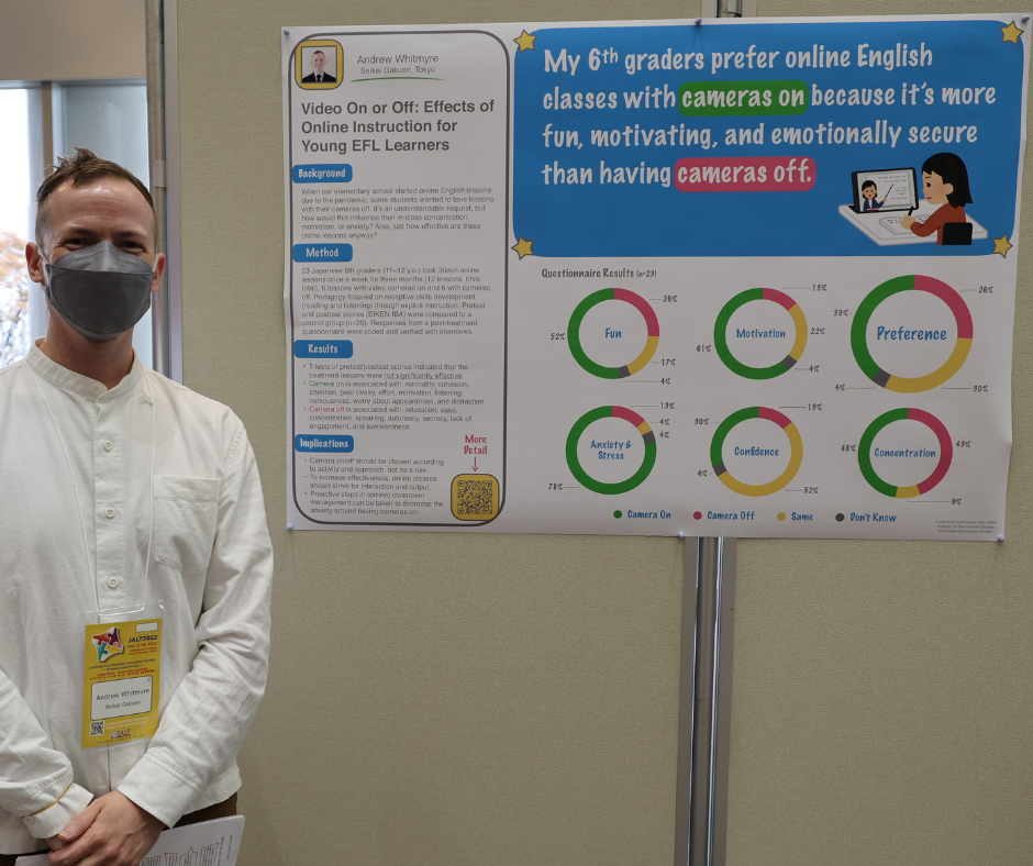
On the left side is the poster title and the traditional contents of a poster that people can read if they're interested. The large space on the right gives the main takeaway information that people can understand from a distance, at a glance. Notice the consistency in colors in the message and the easy-to-understand graphs.
#BetterPoster’s biggest design change is to place your key message right in the middle of your poster, in a huge font, and in plain language.
Poster Examples
For some more inspiration, please see the JALT 2019 poster design competition winners. Now, those winning posters are so great that they might actually intimidate rather than inspire, but don't despair, poster design is something that we all get better at the more we do it.
What works well on posters? What doesn't?
Information that works well on posters includes:
- Graphical representation of data – tables, charts, images that make specific points
- Easily summarized conclusions
- Examples of forms, templates, etc.
- Pilot projects
- Projects that follow the basic scientific paper format of intro-methods-results-conclusion
Information that does not work well on posters includes:
- Complex theoretical results
- Highly textual information
- Exceedingly lengthy or large numerical tables
- Raw data (better to summarize)
- Lengthy bibliography (if citing over 20 articles, make a handout)
Identifying Yourself
It should go without saying, but be sure to include your name and institution on your poster.
QR Codes
You may consider including a QR code (choose the best from this list) with your name, email address and paper title. Please note that some of the QR code generating sites have started imposing a limit on the number of "hits" your code can receive daily (such as 50 clicks). Be sure to read the site's information carefully.
Photos
Also, why not put a face to the name by including photograph(s) of the presenter(s) to help the viewers identify the speaker(s)?
Giving The Presentation
How long?
On the schedule, poster sessions are 40 minutes long, but this isn't like a 40-minute presentation. Participants come in and out throughout the 40 minutes, and you may give the same short summary about four times, and answer the same questions from five different people.
Preparation
You'll be told what time to set up your poster in the poster room. It'll be before the session starts.
A Guide to Presenting a Poster has great advice on how to practice. You should practice short presentations of varying lengths (they suggest creating versions of 2 minutes, 5 minutes and 10 minutes in length), and be prepared to summarize your poster in just a few sentences.
During the presentation
The JALT 2018 Conference team's advice on designing good posters included advice on giving the presentation:
- give people time to look at your poster before you start talking to them; and
- practice your summary
As people are looking at your poster, ask "Would you like me to give you a short summary? It's 3 minutes" (or however long your short summary is). This is a better ice-breaker than "Any questions?"
If you have components of your poster online, point out the QR code to your audience. "My full bibliography is online here," for example, or "This links to a YouTube video of a demonstration of this activity."